Wednesday, 15 April 2015

Life drawing update

This year, I made a very conscious effort to attend as many life drawing classes as I could. Aside from the mandatory classes on Tuesday, there were sessions running all day every Thursday. Not only did this provide a good release from course work, but also gave me lots of opportunity to practice and improve my life drawing and pencil skills.

For a long time while life drawing I have been very focused on capturing gesture and good proportion, usually doing no longer than five minute drawings. These open sessions also gave me the chance to focus on more slightly longer poses, these are a few done in minutes or so.


Tuesday, 7 April 2015

Container City, Post mortem

At the beginning of the project we all had some very different ideas of where the project could go, it took us a while to finally arrive at an idea that we all liked and agreed upon. Even so, I don't think that any of us had any real idea of how it was going to turn out visually, as naturally we all had a different idea of how the final product was going to look. In the end, I think we ended up with a very nice looking project however much we may have winged it along the way. A lot of the assets turned out very nice, and worked together to create a cohesive whole. The modularity of our container city was also a strong point in our work as most of our assets were modular and fit together very well. However I think things could have been a lot better if we had established a more solid visual direction earlier on other than "lets make Kowloon walled city but with shipping containers". Its a simple concept, but again, I think everybody has a different vision in their mind of how that one specific thing could look, especially when that idea only exists as a statement.

I suppose what I'm trying to say is that we had to get to the very end of our project before we knew how it was really going to look, which isn't always a good thing. We could have done more concept art earlier on in the project to get a solid visual goal, but it wasn't as simple as that as we also had to manage our time effectively as well as think about other elements of the project such as the game design, playability and other aspects of the engine work. These things took up a lot of time for most of the team. There was a point of relief for us during the stage of our project when the level finally came together, as up until then we weren't sure how it was going to look. We ended up with, what I think, is a fairly nice looking project, and one that also plays out smoothly for the player.

Monday, 6 April 2015

Container City part two

When first starting to construct assets for our container city we had a few hiccups with the modularity when trying to set a standard for the scale we would use. We decided on a final scale that would export with the correct proportions in engine, this way we wouldn't have to mess around scaling assets in Engine and disrupting the modularity.

I modeled the primary container that would be used as the main component for building the level. When building the level, the container was broken up into segments; front, top, back and sides. This meant we could save a lot of tri's on areas where we wouldn't see the full container, which helped our fps immensely. I also modeled numerous assets for populating the level such as an oil drum, pallets, gas tank and modular shop shutters to be used in place of the sides of some containers. Since the container would be the primary modular asset featured throughout the level, this was modeled first and used as a scale reference when modeling all the other assets.


When modelling the container, I thought the corrugated edges on the side panels were far too sharp. Chamfering the corners meant using far too many tri's, so I decided to have the corrugated side panels all on the same smoothing group and bake a very high poly chamfered version of the side panels into the low poly. This made the corrugated sides looked more like the sides of a real shipping container with much softer light hitting the edges. Rather than have another albedo texture for a different coloured container, I created instances of the original material in Engine to create colour variations. Since this project, I have learned a lot more about the high poly baking workflow in Max, and would probably have taken some different approaches when creating my assets.

Below are some final shots of our level:


Saturday, 4 April 2015

Container City, Week One

First project back after Christmas tasked us to create a section of a city or inhabited area created entirely out of shipping containers. This was a group project and we needed to show at least some small element of interactivity and playability in the level.


On the first day we sat down as a group and discussed various ideas on themes and locations for our container city. We came to around 26 final ideas that we liked, including prisons, rebel bunkers and a drug cartel, but the one we eventually decided on was a container city that would be inspired by the Kowloon walled city in Hong Kong. A densely populated and ungoverned fort like city built entirely from layer upon layer of makeshift buildings and scrap that was demolished in 1993.

What attracted us to the idea of a container city based upon Kowloon was the dirt, grittiness and dark dystopian nature of the city and its maze of alleyways filled with makeshift shops and houses. Kowloon is a city built upon layers. We thought this would make a great game level with lots of potential for detail, material definition and verticality.

Another aspect of this project we were going to have to learn was modularity. This is a very simple concept in Game design and refers to how individual assets can be reused and recycled in various ways throughout a level or game. This can include simple assets such as separate sections for networks of pipes, or larger more complex sections of dungeons or buildings. In our case, we were going to employ modularity by having a primary container repeating throughout the level that was going to be edited in different ways via other smaller assets such as windows, pipes, shop stall etc.

A good source we used to learn about modularity was Bethesda artist Joel Burgess's blog post on Modularity in Skyrim 

Another large part of this project was going to be the level design. This is something none of us had touched upon as our course is largely focused on creating art and assets. We struggled for a good while debating our level design, and decided to blockmesh a few of our ideas and get some tutor feedback before deciding on a final layout.

Sunday, 14 December 2014

Character Dichotomy, modelling and textures

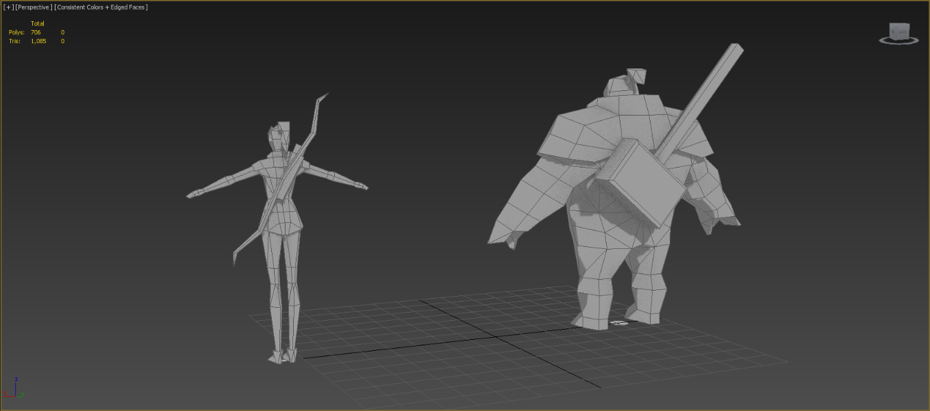
As I chose to go for low tri budgets with my characters I decided to skip drawing up orthographics and began box modelling my characters by eye, working directly from the concepts. It took around 2 days to model each character, including testing out rigs and refining the topology so that the models would deform well when the final rig was made. I also picked up a few tips on low poly modelling from the low poly project blog, such as using planes for fingers to save tri's.


The overall detail in the models was very basic. I was going to rely on the old school method of hand painted diffuse textures in order to create the illusion of depth and paint in fake ambient occlusion shadows. When rendering and viewing the models in the viewport I also switched to using the 'consistent colors' shader. This meant that the models would be lit as 'flat' and any illusion of lighting would come mostly from the painted textures. This is a pretty common way of working with textures for ultra low poly modelling.


Rigging for these characters as fairly easy going due to the low try count, however the low tri count meant that the characters were limited in how extreme there movements could be before deforming too much. Posed within reason I think the rigs work very well, and the characters can handle most basic maneuvers without any deformation issues.


When texturing I needed to use a texture size that was in line with the kind of tri budget I was using, so I went with the same low resolution 128x128 textures that Tommy Tallion used for his TF2 models. I painted them at a slightly bigger, but still very small size of 512x512. If I had painted them any bigger then by the time I resized much of the pixels would bleed into other areas of the UV map.
Each of the weapons also got their own 64x64 textures.

UVW sheets and painted textures at 512x512

Even though the textures are very blurred at this size the important thing was that the designs could still be read well from afar. I imagined these characters to be inhabitants of some kind of isometric style game world, and such would be viewed from afar and very small on screen.

here are some final renders of my characters with textures applied -


Ranger sheet


Brawler sheet

..and some basic poses -


As a quick conclusion, I'm pretty pleased with how these two turned out. Personally I feel that I achieved the goal of creating a dichotomous duo, with a consistent style and strong silhouettes. While at first I wanted to create a very high poly model, there was a lot to learn from creating characters under these kinds of technical restraints. It forced me to think solely about the strength of their overall design, and how I could best utilize my tri and texture budgets in order to convey their designs as best I could.


Saturday, 13 December 2014

Character Dichotomy

Our final project of this term was a character dichotomy project. If you're unfamiliar, that basically means two characters that work together harmoniously, yet have distinct and contrasting characteristics that set them apart.

Some popular video game classics that come to my mind are Ratchet and Clank, Jack and Daxter, Mario and Luigi and even Joel and Ellie from The Last of Us. In terms of Movies or television you could point towards Hellboy and Abe, Arya and the Hound in Game of Thrones or Rocket and Groot from Guardians of the Galaxy. Asterix and Obelix or Calvin and Hobbes are also some perfect examples of dichotomous characters from cartoons/comics.

There are literally endless examples of dichotomous characters throughout video game, cartoon, writing and movie history.

Talking about the brief for this project, we were given exactly 3 weeks to design two dichotomous characters of our own. As a minimum, we had to model and texture at least one of these characters, however stretch goals included modelling both characters, as well as adding rigs and animation.There was no given tri budget for this project either, which meant we could go wild. However, I will talk briefly about how this wasn't necessarily the best idea.

As there were no style guides or technical restrictions I thought that this character project would be the perfect opportunity for me to learn about high poly baking and Zbrush, so when I began concepting I designed characters with the idea of having some level of realism in mind, and with the idea that I would have one very detailed character modeled and textured by the end. My idea was two characters. One a burly brawling type, and the other an agile ranger style character.


First concepts

In fact, the tutors advised avoiding Zbrush all together for this project. The emphasis was on strong overall design, and the dichotomy of two characters. Not having a single character with a lot of surface detail.

During the first presentation to the tutors, I was given feedback to change their designs. The tutors pointed out that these characters were too similar, and didn't necessarily create visual unity. They were right, and I had designed the characters with little thought towards dichotomy as I had only planned to model one. I decided to go back to the drawing board and take a very different angle.

Since the emphasis of this project was having two characters that worked together visually, I decided that I would model both in the end. I had to think of a way I could realistically model, texture and rig two characters before the deadline.

While thinking of ways I could create both characters in this time frame I remembered 3D artist Tommy Tallians' rendition of the Team Fortress 2 characters. He created the entire cast of Team Fortress 2 as ultra low poly 500 tri characters. This illustrates that the strongest designs will read well and still work at the most basic level. I decided that I would try to create both my characters with the same budgets and low resolution textures.


Team Fortress 2 cast, by Tommy Tallian

Team Fortress 2 cast, Valve

I began by re concepting the male character, based of an earlier silhouette that people liked. I also pushed for some level of stylization too, as it lends itself well to low poly modeling.


This led onto some re-concepting of the girl too, in order to fit in with the new style I was aiming for.


After some thought and sketch overs, what I ended up with was the same two character archetypes that I began with, but with a totally different style and stronger silhouettes.


Modeling in the next post...

Saturday, 6 December 2014

turret post mortem

As mentioned in my last post, there are a couple of things that I'd like to have done differently about my turret project.

My turret worked perfectly with the blueprints in UE4, turning 360° and pitching up and down without any issues or clipping, and while it looked good, it didn't really make sense. I had designed my turret with the idea of it being manned by a person, however the blueprint was designed with the idea of an automated turret.

Even if my design is a 16th/17th century inspired cannon, I think it would have looked a lot cooler if I were to have found ways of making the turret appear automated. Too late in the project I had a few ideas of how the cannon could hold and load extra cannonballs, such as integrating some kind of snooker-like rail onto the side of the cannon.

Any of these could have been integrated into the design

In terms of how the cannon would realistically be able to detect people or even pitch and rotate by itself isn't really important by now, as at this point the design would be heading into the realm of fantasy anyway, so it doesn't necessarily need to be accurate or realistic.

From a video game standpoint, most of the time having a design that is actually functional isn't as important as having something that looks believable. There are a lot of fantasy games with repeating flintlocks and automated fantasy turrets, such as this-

Warhammer- Engineers turret

Any old looking turning mechanism and a bit more bulk to the design could have worked to help the design appear 'automated'. However, there are other things I would certainly have to change about the design too. A less realistic and more cartoon art style such as the above would be more appropriate for an 'automated pirate cannon'.

So, in and of itself I think my design works, and certainly wouldn't look out of place in a realistic game universe if it were being manually controlled. However in terms of following the blueprint to look better as an automated design, I would definitely have to go back to the drawing board.