Wednesday, 29 October 2014

Film room project, the post mortem

I'll be honest, I'm quite pleased with our final outcome, not necessarily in terms of how much it matches up to the original shot. In and of itself, I feel that our scene definitely holds something of its own, even if we lost a lot of the Pixar magic the original has.


Pixar's Toy Story 3
 
DMU game art students attempt Toy Story

With exception of the characters, who were not part of the brief, it's pretty obvious to anyone comparing the two what the main difference is here. However, its not the case that we couldn't see where the differences were. The problem lay within our technical understanding of a, how to use lighting, and b, our knowledge of how to use Unreal engine. We just couldn't get it to match.

Here's a crude breakdown of the lighting in their scene:

Warm sunlight beams through the window, hits the boxes & floor directly. Warm light bounces from the floor to other areas of the room, lighting it indirectly. Bounced light is picked up by inlays on the doors, the handles on the drawers and other things. Diffused light from outside also enters the room from window behind camera. It gets pretty technical.

Even if we could see what was going on, we just couldn't work out how they did it. We dissected their scene, and it took all kinds of trial and error and faking all kinds of lighting to get as close as we did. There were so many factors that effected the lighting that it usually ended up being a trade off. We would adjust the lighting to make one area of the room match closely, but in turn another area would change completely. This was the same when colour grading the shot.

Throughout the engine part of the project, we felt as though the whole scene was held together by tooth picks, except we weren't sure where the tooth picks were. We encountered a lot of technical difficulties and spent a lot of time looking things up. Things would fall apart for reasons we couldn't find, we'd apply a decal to the wall, and the lighting would break. Life's mysteries!

Knowing what we know now, if we were to do this project again we would probably budget more time towards working within the engine and lighting the scene, as well as take the time to do some learning on lighting. 

On the other side of all this, we considered that Pixar is composed of some of the best artists in the entertainment industry. They would've had a huge budget, more time, many artists and more than likely separate departments dedicated solely to things such as lighting alone. As four students, we think we did an alright job in the end.

Either way, this project was a highly enjoyable and huge learning experience which definitely opened us up to things we can work to improve for future projects. I gained a much better understanding of physically based rendering as well as working in Unreal 4 and had a good experience working within a group.


Monday, 27 October 2014

Film room project, production

In my last post, I talked about our choice of room. Here I am going to talk briefly about how we developed and built the room.

Work on the room began by applying our chosen shot to the Max viewport background, and using perspective match tools to align the viewport grid and begin creating a proxy mesh; a rough 3d block in of the entire scene. This served as a scale reference when creating the actual assets. We each created our own, and as a group decided on the most accurate to work from.

perspective match


Before we dove into any 'final' modelling we were basically tasked with analyzing the scene, and documenting this via studies and/or paint overs. I produced a simple study, focusing on entirely on readability and the colour palette in Andy's room.


As much as I enjoy painting and believe that it is very important to analyze, there were some things about this stage that I personally thought to be unnecessary. This stage was constantly referred to as the 'concept stage' A concept is an idea, and in this project we were already working from a fully realized idea. Andy's room has already been taken through an entire design process from by artists at Pixar, and the concept was already there. Here, we are duplicating the scene as a means to study.

Once the proxy had been made we divided the assets between members of the group and started on the models. We had to really plan our timing as we needed to allow plenty time for texturing and also dealing with technical work in Unreal.


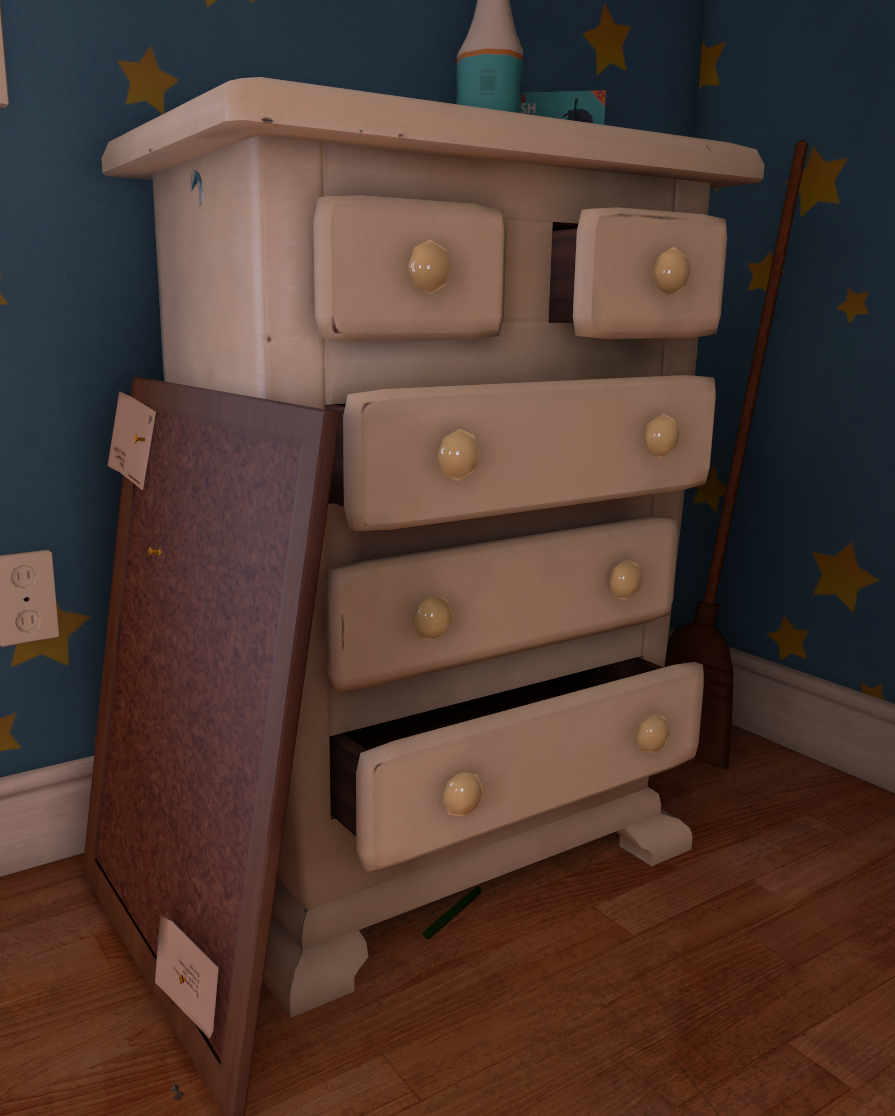
When creating the models, I gathered as many references of the asset in the scene at different angles and used those to draw up some orthographs. I used these as a basis for my model, but eventually deviated away and constantly referred back to the original source material. Despite the chest of drawers being the most complex I actually spent most of my time trying to optimize the boxes, allowing for a good amount of detail without using an excessive amount of tri's.

assets in max

For the floor of Andy's room I used a photo of my own bathroom floor and created a tileable texture from that. The floor was very important to the entire scene, and had to have just the right amount of reflectivity without being too noticeable from a distance.


testing the floor in Unreal

We constantly checked our textures in Unreal, there was a lot of trial and error with creating the maps and seeing how they appeared under different lighting conditions in engine. One of the hardest parts of creating the chest of drawers for example was getting the subtle wear and tear just right.


chest of drawers within the final scene

Once everyone had finished their models I imported everything into a single max scene. Even with the proxy as a scale reference certain assets had gone somewhat out of proportion as we worked on them. Using perspective match again I matched each asset to the scene and rescaled everything accordingly before redistributing the resized models which would go on to be used in the final scene.


second proxy


Below is our final shot in engine, with some subtle post process colour grading. I'm going to save my thoughts on the final shot, and in my next post I'll spend some good time talking about what went wrong, what went right and where we could improve.


final shot, Andy's room


Saturday, 25 October 2014

Film room project, choosing a room.

Our second project of the year briefed us to recreate as accurately as possible an iconic room from any film or TV series of our choice. Even with a group of four this was an extremely challenging project and had to be completed in three weeks. I can honestly say that in the last four weeks I've already spent more time in the universities labs than I ever did during the whole of last year.

So far, I'm feeling much better about the course and the new course structure this year as opposed to last year. It makes me much happier that there's no longer numerous unrelated and overlapping projects from the different modules. Instead, the visual design and game production modules now seem to interrelate and work seamlessly together. Overall, the course feels a lot more refined and gives you a lot of time for each project. Because of this, I'm personally feeling more motivation to work much harder on each individual project and have it looking the best I can make it, as opposed to juggling time and quality between projects like last year.

To begin our project, we started out by creating mood boards of shots from all of our favourite films or television series with rooms that we'd like to recreate. Here's one of mine-

GoT- The Eyrie
   
At first, we all agreed as a group that the Eyrie's throne room would be an awesome choice. We all love Game of Thrones, and felt pretty excited about the idea of re-creating this room. This was our first mistake. The focus of the project was on colour, lighting and mood. Even though Game of Thrones has a lot of that, we'd basically chosen this room almost entirely on the basis that we enjoyed game of thrones and the fantasy genre, as opposed to considering other factors of the project. In order to progress, we had to distance ourselves from the films/series and any personal attachment we had to them, and consider the individual shots for what they were in terms of colour, light and composition.

Our tutors definitely thought we had chosen something cliché, and encouraged us to choose another film. Max, a member of our team, put together another mood-board with a lot of variety.

Max's moodboard

Gathering other opinions from peers and tutors we found that the shots from Pixar movies were a particularly popular choice. This led to us finding and deciding upon a particular shot from Toy Story 3 that the team all loved, this decision also had positive responses from tutors during presentation.


Moving out, Toy Story 3


What was cool about the final decision to do Andy's room was that even though we all liked the scene, it was a scene we would probably have never concluded upon by ourselves. There was a lot here that appealed to us, particularly the light of the sun hitting the box and floor, and bouncing to other areas of the room. Also, while the scene appears to be relatively simple if compared to some grittier live action films, there is actually a lot of subtle things going on. The reflectivity of the floor, slight wear and tear on furniture and the darker areas of wallpaper where Andy's posters had been and prevented any bleaching from the sun were all things we were going to have to consider when re-creating this shot.


Thursday, 23 October 2014

year two, first week roundup

After a long summer spent drawing and painting I've now begun year two on game art design here at uni.  Last year I basically neglected this blog. But this time around its got to be a weekly thing.

Our first project of the year was only a week long and doubled up not only as an introduction to working with PBR (physically based rendering) in the new unreal engine 4, but also as an introduction to working as a team to create assets before exporting them into a scene.

The project was called 'asset swap' and involved creating assets such as a trestle table, bench and a shield for a small viking banquet. It began by assigning one different asset to each person in the group, once that person had developed concepts for the asset, the concept was then given to the next person to begin modelling, and the model passed on again for texturing and so forth. This process of basically meant that everyone in the group worked on every asset at some stage.


Personally I thought this process came with some drawbacks, for instance, when it came to texturing you had to hope that the person before you had made a good job of unwrapping the model efficiently, otherwise you were going to have a harder time texturing. For the most part though, I thought this process helped to achieve a consistent style throughout each asset, as opposed to if people had worked on assets individually.


The hardest part of this project for me was getting my head around the new physically based rendering in UE4. This is a new way of texturing that does away with specular and diffuse maps, replacing them with albedo, metalness and roughness maps.With the old way the amount of reflectivity and shine of a material was defined by the levels of specularity in the specular map, whether this was metal, plastic or skin. Now you can define whether or not a material is a metal, and then you can define the roughness/smoothness of a material, which will dictate how much light information is picked up by that surface. Traditionally you might also paint 'fake' light information such as ambient occlusion on the diffuse texture, with an albedo map however you use purely flat colour information as all the light is defined by other maps and scene lighting. Its an easy concept to understand and actually quite simple in practice, but still something I have yet to grasp properly.

Friday, 23 May 2014

Ideal Job role

I've pretty much always wanted to make a career as a concept artist. As I said in my last post, I made it my goal when I was around 13 or so after being inspired by some awesome concept art for video games and I knew then what I wanted. Video games had always been inspiring me to draw anyway, but at that age it never really occurred to me that I could actually make a career out of art, back then, I didn't even realize that such a job existed in the games industry. To me, it seemed like the coolest thing at the time, the idea of being able to draw the things you love for a living while getting paid for it was really ideal, and to be honest, it still is now.

It's safe to say that 6 years on, I think I still want to be a concept artist. Well, not entirely. The idea that you get draw whatever you like or enjoy isn't entirely true. There's always going to be those specific jobs or projects that you don't enjoy doing, just like certain projects here at university, and the same can be said for most areas of work. But something that has occurred to me after years of drawing and moving towards my goals is that you could not survive in this industry if you treat it like some kind of ordinary day job. It has to be something you are genuinely passionate about if you hope to succeed and move forward.

Usually, I try not to think about money when assessing the direction I take my art. I don't want thoughts of money or financial stability dictating the direction that I take. Sometimes I feel as though I ought to be doing things differently, painting this way rather than that, just satisfy some kind of criteria that will perhaps improve my chances of me get me a job as a concept artist. For me, there is always an internal conflict between moving in a direction that will help me land a job, or moving towards my own personal goals. Honestly, I think money should be a bi-product of doing what you love, especially with art.

While studying at university I have come to the conclusion that having a job in the games industry is not the be all and end all. Since I started, I have less of an idea of what I'd like to be doing when I finish, as the idea of working as a concept artist is much less appealing to me than before I came to university. Personally I feel that even if I never land a job in the games industry, I'll always be satisfied so long as I'm in a position where I can create art and improve. Right now though, I just want to get better at painting. My current goal is aiming to improve the work I do from imagination by applying all the fundamentals I have been learning from producing studies. I think that with time, and as I become more confident in my abilities to create good art, I will have a better idea of what I would like to do post graduation.

To conclude, I think that rather than narrow down what I would like to do as a career, my experiences at university have instead forced me to question how I would really feel about working in the games industry as an artist. In some ways, it would be nice to have an income from creating art, however I have to remember that if I want to be successful as an artist then money cannot be the top priority. I feel that if I were to get a job in the games industry for the sake of having a job and income, that I would not necessarily be happy, and for this reason I think it would be best for me to have more time on improving my art and thinking about what I would like to do before I come to any conclusions on an ideal job role. At this present time, I am focusing on the fundamentals.


Thursday, 1 May 2014

Personal enquiry: My own interests

As with some of the last post, I finally feel as though I can talk more freely from a first hand point of view about my own experiences with video games. Looking back at parts one and two, It seems like I pretty much wrote those posts like they were some kind of formal essay, most likely because I knew little about what I was writing, couldn't find much of interest to me and also because I didn't live through those periods. This personal enquiry task will allow me to talk more easily about the things that interest me personally.

Admittedly, I've never been much of a heavy gamer, but without having played some of the games that inspired me I probably wouldn't be here studying a game art design course. A lot of my peers are gamers, but personally I've just always had a deep interest in concept art, and art in general. Perhaps its just the subject matter that I like about games and concept art? I've always liked fantasy clichés and archetypes for instance, but I tend to take a lot of notice of the execution of work and paintings too. I like the work of a lot of traditional oil painters such as Anders Zorn and John Sargent, but specifically I enjoy seeing how concept artists or digital painters in general have been employing those traditional painting methods within a new digital medium. 

Besides just the art however, there are definitely a few games I can name that have inspired me from an artistic standpoint too, as they should. After all, most games are full of art aren't they? They are visually stimulating, full of things to look at. One of my personal favorites is Shadow of the Colossus, for its dark and gritty world full of earthy green and black tones. Its a very artistically driven game and games have become ever more oriented towards visuals. Even if I already had an interest in drawing before hand, I don't think I would have discovered concept art before playing video games. To stop myself from rambling on any further, the topic I'm basically going to talk about is concept art, artists in the industry and what it is that inspires me so much about these.

So what is concept art? Well, first I'll take a dictionary definition of the word concept:

1. A general idea derived or inferred from specific instances or occurrences.
2. Something formed in the mind; a thought or notion.
3. A scheme; a plan:

Basically, concept art refers to any art that presents an idea. In the case of video games that is typically anything varying from character design, environments and levels, weapons, Armour and vehicles. Just take a look at these for instance.


Lord of the Rings Online Archer concepts, Wes Burt


Early 'Bayonetta' concepts, Wes Burt


These are some awesome examples of character concept art by Wesley Burt. The characters are stood in a neutral posture that is easy to read, they have cool silhouettes, and they are painted in a way that clearly shows the different materials and details in their armour designs. Basically, you could make a 3D model from these concepts. A lot of the time, I think the concept art looks a lot better than the final in-game product. Just look at those Bayonetta concepts for instance, personally I think any one of those looks way more aesthetically pleasing than the final product that ended up in the game. But then again,  these concepts didn't fit in with the overall style of the game, which has a more anime style vibe. In my opinion, these still look cooler though.


Lord of the Rings Online, Horse Lord concepts -Wes Burt

Something else I love about character concept art is how easily you can begin to visualize a back story for these characters. There's a whole other universe surrounding them, and this is frequently shown in their armour or costumes, which can often contain cultural references from our world too. This is important because fictional characters and worlds, to an extent, still need to be somehow relatable to our world and the familiar in order to make sense to the player. Just look at the Lord of the Rings Online concepts for instance, they might be inhabitants of a fantasy world however they still have designs that hold true to a medieval period from our timeline. Their attire are ornate and glorified versions of clothes and armour akin to that seen in the middle ages. Science and Fantasy fiction draw parallels and take inspiration from reality, and this makes sense; You need to draw from what already exists in order to create something new. Tolkien himself even did this when writing the Lord of the Rings.

Besides all this, I just love the overall aesthetics of the character concepts. The silhouette, forms, lighting, values and other fundamental things. This brings onto another thing in digital painting and concept art, fundamentals and execution. My first endeavors into concept art started when I was around 13, my dad had bought me the Art book featuring all the concept art done for World of Warcraft. I was pretty blown away, and spent long hours staring at the pages wondering how they made it look so awesome. Of course back then I didn't really know that fundamentals in art were a thing in the process of improving your work, I just kept on drawing whatever for fun. But a few years later after exploring different art forums online I discovered various ways to improve my fundamentals.

It was from here I started to produce studies that would help me improve, I also discovered literally hundreds of contemporary concept artists that have inspired me to this day. One of those in question is Craig Mullins.

portrait by Craig Mullins
untitled - Craig Mullins

Mullins is a perfect example of an artist that takes a very traditional approach to digital painting. I love his work for its painterly and loose style, focusing on an abstract and suggestive approach to creating work, as opposed to being very methodical and building up from lines etc. To me, his work shows that you don't need to over render in order to get your idea across, his paintings read well straight away without the need for minor details. He's always looking at the bigger picture and blocking in the main values of a painting. This is a thought process and style of painting that I have gradually come to pursue with my own work, I love it not only for its painterly look and broad strokes, but also because the process of creating a painting this way allows me to focus purely on
value, light and forms without the need for over-doing a painting.

To summarise, I guess I've always had some kind of affinity for art, however video games have aided me in narrowing down what it is that I like in particular, both in terms of subject matter and style. Discovering concept art via video games has introduced me to an ever growing amount of awesome artists who work in this industry, which in turn has inspired me to pursue my own goals to work in this field as an artist. At the end of the day though, I don't think it really means that much whether or not I actually land a job in the games industry, as it's far from being my 'end goal'. For instance, I don't think I would feel an ounce of satisfaction with a job in the games industry if I wasn't creating art that I enjoyed. Personally, I'm always going to be focused on improving my art wherever I am as it's something I will always enjoy as a hobby. To me, the career would be the bonus.


References 

Wesley Burt art:  http://wburtconcept.blogspot.co.uk/ and http://wesleyburt.tumblr.com/page/10

Craig mullins art: http://www.emptykingdom.com/wp-content/uploads/2010/01/Picture-7.jpg and http://www.goodbrush.com/


Friday, 18 April 2014

A history of computers part three, development of modern gaming

As the industry entered the 90's and 2000's it had moved away from having dozens of small time companies to having just 3 major competitors on the market. Sony and Microsoft are the two big players fighting for dominance in the modern field as well as Nintendo, although they primarily target a casual/family audience. There isn't an over saturation of low quality disposable consoles either. There are now staple and long term platforms, usually released simultaneously by the industry giants.

3D technology also progressed enormously between the 90's and 2000's with 3D games eventually becoming a staple platform for gaming. Autodesk started to release their first basic 3D packages throughout the 90's and the release of the playstation 1 in 1994 saw the rise of more 3D games. One of these games in question, that helped to spur the playstations success throughout the 90's was Tomb Raider, released in 1996.

Tomb Raider 1996

One thing that is quite apparent about technology over the last century is that the more progress we make, the faster the progress seems to come, this applies to any areas of technology, especially computers and video games. Having around a dozen sequels spread across various consoles, tomb raider is a really good example of a game that showcases the amount growth and development 3D technology for games has made over the last 20 years.

2013 Lara, 1996 Lara

The difference is pretty clear, you don't need to look far to see how much better modern Lara looks. This is the same character 17 years apart, and all the other Tomb Raider games in-between these two show the smaller steps it took to reach this point. When you take a look at the development of gaming as a whole since the 1960's, it's hard to believe that such a huge difference in quality has been made in such a relatively short time span. Most AAA game developers are constantly striving for more realism, and it's the advancements in computers that have allowed them to pursue that.

That said, most graphical improvements now seem to be pretty linear, or barely noticeable. It seems like the industry is getting to a point where things are starting to slow down. Maybe. This might be down to the hardware limitations set by the consoles we've had for the last 8 years. However next gen games for the PS4 and Xbox One seem to be boasting some very noticeable improvements in graphics.


The XboxOne and Playstation 4, both released in 2013


A really good example is the in game Alpha footage for Assassins Creed Unity.

When I got an Xbox 360 back in 2007 the first game I played was Assassins Creed. Having had a PS2 for the last 6 or so years I couldn't believe how great it looked, and there's no way I could have imagined a games graphics looking any better. Ubisoft made some minor improvements to the next 3 installments but nothing drastic.

Assassins creed 3 and 4 followed in 2012-13 with a new engine and some very nice improvements to the physics and all round graphics, but I had seen enough by then that it didn't really grip me as much as when I played the first game for the first time. Then they released this trailer:


This is what I love about the games industry. Just when you think the games couldn't look any better visually, they pull out something like this. Although you have to consider the fact that the higher specs of the next generation consoles have finally allowed developers to start creating games with much higher detail. To an extent developers are limited by the specs of mainstream consoles, because their games need to run on those machines.

Remember those cinematic cut-scenes in old Playstation 2 and Xbox games? which were way better looking than the game itself? We'd watch those and then ask ourselves "I wonder if gameplay will ever look that good"? Truth is, I think developers are reaching beyond that point already, and it's about time. The in-game graphics of modern games now look marginally better than the cg trailers and cinematics in older games, and in some cases the gameplay graphics are so good now that they even work as cinematics themselves. The above video proves that. The games Industry and all its artists are constantly finding new ways to improve the look and realism of games.


In game graphics are starting to look just as good as the fancy cg trailers.
We're getting there.


Anyway, I can't help but feel I have digressed a little with this whole 3D advancement thing. Having lived through this current age of gaming as more of a spectator than a gamer, perhaps I feel as though the main development in games has always been in the graphics. Even so, I think most gamers can agree that better graphics does not necessarily equal a better and more enjoyable game though.

We see pretty much the same game mechanics in every Assassins Creed, Call of Duty or whatever that gets pumped out year by year. Yea, maybe it looks better, maybe its shinier and prettier, but at its core is the game really any different? It's a business decision and there's money at stake, but sometimes it feels like developers are playing it too safe. Personally I've had more fun sliding down walls on super meat boy than I have scaling up rooftops on Assassins Creed.