Work on the room began by applying our chosen shot to the Max viewport background, and using perspective match tools to align the viewport grid and begin creating a proxy mesh; a rough 3d block in of the entire scene. This served as a scale reference when creating the actual assets. We each created our own, and as a group decided on the most accurate to work from.
 |
| perspective match |

Before we dove into any 'final' modelling we were basically tasked with analyzing the scene, and documenting this via studies and/or paint overs. I produced a simple study, focusing on entirely on readability and the colour palette in Andy's room.

As much as I enjoy painting and believe that it is very important to analyze, there were some things about this stage that I personally thought to be unnecessary. This stage was constantly referred to as the 'concept stage' A concept is an idea, and in this project we were already working from a fully realized idea. Andy's room has already been taken through an entire design process from by artists at Pixar, and the concept was already there. Here, we are duplicating the scene as a means to study.
Once the proxy had been made we divided the assets between members of the group and started on the models. We had to really plan our timing as we needed to allow plenty time for texturing and also dealing with technical work in Unreal.


When creating the models, I gathered as many references of the asset in the scene at different angles and used those to draw up some orthographs. I used these as a basis for my model, but eventually deviated away and constantly referred back to the original source material. Despite the chest of drawers being the most complex I actually spent most of my time trying to optimize the boxes, allowing for a good amount of detail without using an excessive amount of tri's.
 |
| assets in max |
For the floor of Andy's room I used a photo of my own bathroom floor and created a tileable texture from that. The floor was very important to the entire scene, and had to have just the right amount of reflectivity without being too noticeable from a distance.

 | |
| testing the floor in Unreal |
We constantly checked our textures in Unreal, there was a lot of trial and error with creating the maps and seeing how they appeared under different lighting conditions in engine. One of the hardest parts of creating the chest of drawers for example was getting the subtle wear and tear just right.


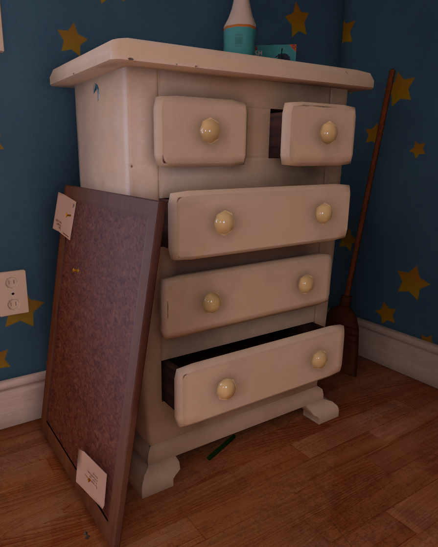 | |
| chest of drawers within the final scene |
Once everyone had finished their models I imported everything into a single max scene. Even with the proxy as a scale reference certain assets had gone somewhat out of proportion as we worked on them. Using perspective match again I matched each asset to the scene and rescaled everything accordingly before redistributing the resized models which would go on to be used in the final scene.
 | |
| second proxy |
Below is our final shot in engine, with some subtle post process colour grading. I'm going to save my thoughts on the final shot, and in my next post I'll spend some good time talking about what went wrong, what went right and where we could improve.
 |
| final shot, Andy's room |
No comments:
Post a Comment