Sunday 14 December 2014

Character Dichotomy, modelling and textures

As I chose to go for low tri budgets with my characters I decided to skip drawing up orthographics and began box modelling my characters by eye, working directly from the concepts. It took around 2 days to model each character, including testing out rigs and refining the topology so that the models would deform well when the final rig was made. I also picked up a few tips on low poly modelling from the low poly project blog, such as using planes for fingers to save tri's.


The overall detail in the models was very basic. I was going to rely on the old school method of hand painted diffuse textures in order to create the illusion of depth and paint in fake ambient occlusion shadows. When rendering and viewing the models in the viewport I also switched to using the 'consistent colors' shader. This meant that the models would be lit as 'flat' and any illusion of lighting would come mostly from the painted textures. This is a pretty common way of working with textures for ultra low poly modelling.


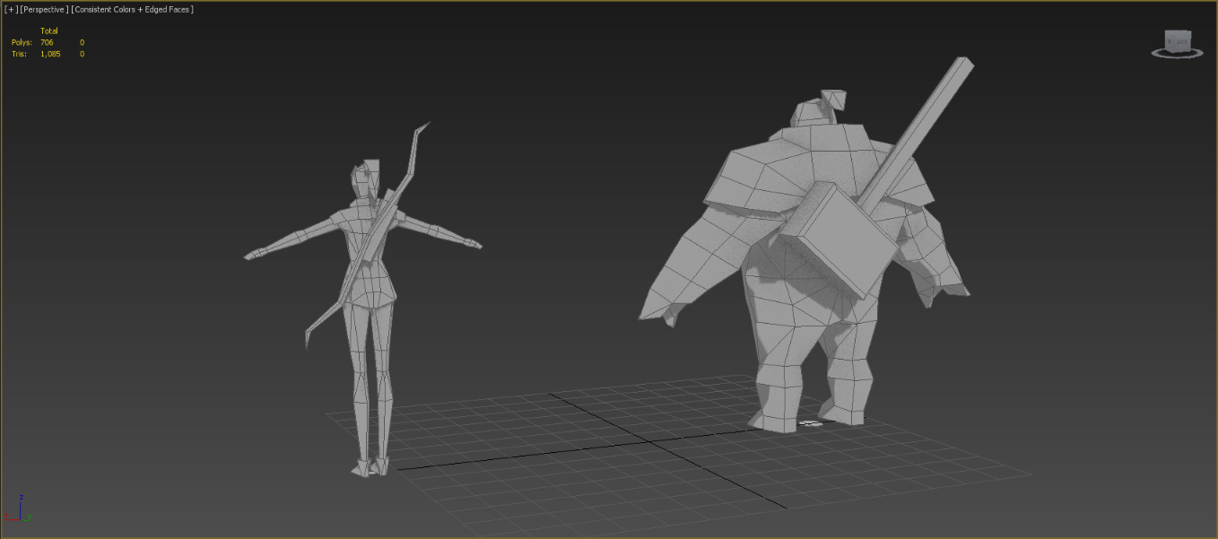
Rigging for these characters as fairly easy going due to the low try count, however the low tri count meant that the characters were limited in how extreme there movements could be before deforming too much. Posed within reason I think the rigs work very well, and the characters can handle most basic maneuvers without any deformation issues.


When texturing I needed to use a texture size that was in line with the kind of tri budget I was using, so I went with the same low resolution 128x128 textures that Tommy Tallion used for his TF2 models. I painted them at a slightly bigger, but still very small size of 512x512. If I had painted them any bigger then by the time I resized much of the pixels would bleed into other areas of the UV map.
Each of the weapons also got their own 64x64 textures.

UVW sheets and painted textures at 512x512

Even though the textures are very blurred at this size the important thing was that the designs could still be read well from afar. I imagined these characters to be inhabitants of some kind of isometric style game world, and such would be viewed from afar and very small on screen.

here are some final renders of my characters with textures applied -


Ranger sheet


Brawler sheet

..and some basic poses -


As a quick conclusion, I'm pretty pleased with how these two turned out. Personally I feel that I achieved the goal of creating a dichotomous duo, with a consistent style and strong silhouettes. While at first I wanted to create a very high poly model, there was a lot to learn from creating characters under these kinds of technical restraints. It forced me to think solely about the strength of their overall design, and how I could best utilize my tri and texture budgets in order to convey their designs as best I could.


Saturday 13 December 2014

Character Dichotomy

Our final project of this term was a character dichotomy project. If you're unfamiliar, that basically means two characters that work together harmoniously, yet have distinct and contrasting characteristics that set them apart.

Some popular video game classics that come to my mind are Ratchet and Clank, Jack and Daxter, Mario and Luigi and even Joel and Ellie from The Last of Us. In terms of Movies or television you could point towards Hellboy and Abe, Arya and the Hound in Game of Thrones or Rocket and Groot from Guardians of the Galaxy. Asterix and Obelix or Calvin and Hobbes are also some perfect examples of dichotomous characters from cartoons/comics.

There are literally endless examples of dichotomous characters throughout video game, cartoon, writing and movie history.

Talking about the brief for this project, we were given exactly 3 weeks to design two dichotomous characters of our own. As a minimum, we had to model and texture at least one of these characters, however stretch goals included modelling both characters, as well as adding rigs and animation.There was no given tri budget for this project either, which meant we could go wild. However, I will talk briefly about how this wasn't necessarily the best idea.

As there were no style guides or technical restrictions I thought that this character project would be the perfect opportunity for me to learn about high poly baking and Zbrush, so when I began concepting I designed characters with the idea of having some level of realism in mind, and with the idea that I would have one very detailed character modeled and textured by the end. My idea was two characters. One a burly brawling type, and the other an agile ranger style character.


First concepts

In fact, the tutors advised avoiding Zbrush all together for this project. The emphasis was on strong overall design, and the dichotomy of two characters. Not having a single character with a lot of surface detail.

During the first presentation to the tutors, I was given feedback to change their designs. The tutors pointed out that these characters were too similar, and didn't necessarily create visual unity. They were right, and I had designed the characters with little thought towards dichotomy as I had only planned to model one. I decided to go back to the drawing board and take a very different angle.

Since the emphasis of this project was having two characters that worked together visually, I decided that I would model both in the end. I had to think of a way I could realistically model, texture and rig two characters before the deadline.

While thinking of ways I could create both characters in this time frame I remembered 3D artist Tommy Tallians' rendition of the Team Fortress 2 characters. He created the entire cast of Team Fortress 2 as ultra low poly 500 tri characters. This illustrates that the strongest designs will read well and still work at the most basic level. I decided that I would try to create both my characters with the same budgets and low resolution textures.


Team Fortress 2 cast, by Tommy Tallian

Team Fortress 2 cast, Valve

I began by re concepting the male character, based of an earlier silhouette that people liked. I also pushed for some level of stylization too, as it lends itself well to low poly modeling.


This led onto some re-concepting of the girl too, in order to fit in with the new style I was aiming for.


After some thought and sketch overs, what I ended up with was the same two character archetypes that I began with, but with a totally different style and stronger silhouettes.


Modeling in the next post...

Saturday 6 December 2014

turret post mortem

As mentioned in my last post, there are a couple of things that I'd like to have done differently about my turret project.

My turret worked perfectly with the blueprints in UE4, turning 360° and pitching up and down without any issues or clipping, and while it looked good, it didn't really make sense. I had designed my turret with the idea of it being manned by a person, however the blueprint was designed with the idea of an automated turret.

Even if my design is a 16th/17th century inspired cannon, I think it would have looked a lot cooler if I were to have found ways of making the turret appear automated. Too late in the project I had a few ideas of how the cannon could hold and load extra cannonballs, such as integrating some kind of snooker-like rail onto the side of the cannon.

Any of these could have been integrated into the design

In terms of how the cannon would realistically be able to detect people or even pitch and rotate by itself isn't really important by now, as at this point the design would be heading into the realm of fantasy anyway, so it doesn't necessarily need to be accurate or realistic.

From a video game standpoint, most of the time having a design that is actually functional isn't as important as having something that looks believable. There are a lot of fantasy games with repeating flintlocks and automated fantasy turrets, such as this-

Warhammer- Engineers turret

Any old looking turning mechanism and a bit more bulk to the design could have worked to help the design appear 'automated'. However, there are other things I would certainly have to change about the design too. A less realistic and more cartoon art style such as the above would be more appropriate for an 'automated pirate cannon'.

So, in and of itself I think my design works, and certainly wouldn't look out of place in a realistic game universe if it were being manually controlled. However in terms of following the blueprint to look better as an automated design, I would definitely have to go back to the drawing board.